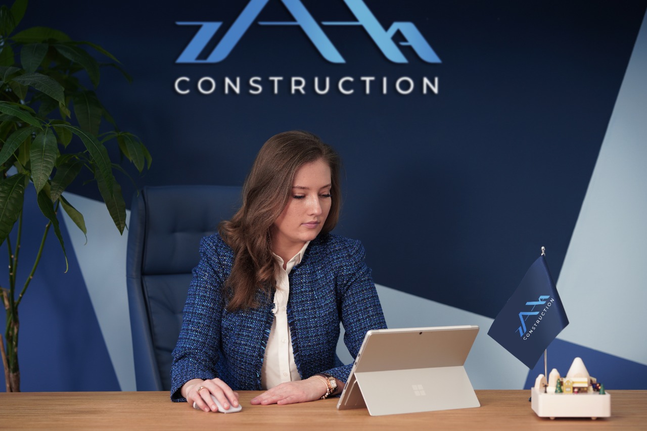
The company Zaha Construction has changed its logotype. According to the company, the reason for this was the abuse of the symbol "Z" by the Russian Federation. It is known that in parallel with the invasion of Ukraine, the Russian military forces are using the "Z" symbol to encourage aggression. As the company says, restyling also provides an opportunity to convey the essence of the brand even more strongly to the audience.
"The philosophy of our company is based on human values, dignity, humanity and improving the quality of life for people. Unfortunately, these values are not proprietary for our neighboring state, which has been clearly visible not only in Ukraine, but also in Georgia for 2 centuries. Due to the fact that we are against aggression, destruction of people's lives and related topics, we decided to change our logotype and its color, which is created on the basis of peace, development, construction, and we wish that together with our change, peace will settle in Ukraine," says Mariam Lortkipanidze, executive director of Zaha Construction.
Zaha Construction is a company included in the York Holding Group, which was founded in 2016 and performs construction projects not only by the order of the holding. Zaha's portfolio includes a multifunctional complex in Tabakhmela called York Town. Also: Lisi View, which combines villas and apartments near Lake Lisi; Bazaleti Resort, which involves the development of a completely new resort area near Bazaleti Lake; The final phase of Bianca Batumi and other projects of the York Towers brand.
As Marketing Director of York Holding Group Otar Kiria says, the logo strategy was based on the semantics of construction.
"We do not mean only construction in the literal sense. The symbols in the logo are growing, indicating development. The arrangement reflects the outline landscape of the city to some extent. The "contour" standard is the strongest in Zaha's logotype, although we strongly respond to the requirements of "weight" and "contrast". Since the naming strategy is also based on the explanatory structure (Descriptive), the main visual identifier was chosen precisely to overcome the absolute threshold as quickly as possible. We worked in-house on the restyling, and the visual belongs to the York Holding Group team member Mikheil Kankia", says Otar Kiria.
"For visual brand awareness, we decided to create a text-based logo ZAHA CONSTRUCTION. We did this for two reasons: one, that it is impossible to confuse it with the logotype of another company, because it can directly refer to the name of the company and its activity, as in our case, and the second - for easy perception of the activity. We have used the elements of the roof of the house, which is repeated by the symbols A and H, which conveys the construction process", says Mikheil Kankia.
A couple of weeks ago, York Holding Group released the materials of the corporate profile, which was created as a result of collaboration with the famous artist Zurab Gomelauri. For Zaha Construction, as an independent company of holding group, the attributes were created with unique designs.
Credits:
Visual: Mikheil Kankia
Strategy: Otar Kiria, Amr Alabwaz
Director: Mariam Lortkipanidze